Pizza wheel sketch
- Helena Jes Starzak

- Feb 22
- 4 min read
Sketching workshop
I attended a sketching workshop hosted by Rumana, a Product Designer at Cyber Heals on Wednesday. It took place at Zuko, an office space and hotel. It was orchestrated by the organisation UX Unite, of which I have been a member for only two months.
What better way to interact and brainstorm than doodling?
This workshop was just as fun and meaningful as it was when I took a weekend course in Graphic Facilitation at FOF Nørregade, which you can read more about here. So, my expectations were high, and Rumana lived up to those by giving short introductions to the concept, but otherwise, the workshop consisted of prompts and a timer.
This is what came out of the prompts
1. Emotional illustrations
2 minute Prompt:
“Sketch facial expressions showcasing these five emotional feelings: Sadness, love, anger, happiness and hopefulness”.
Result:
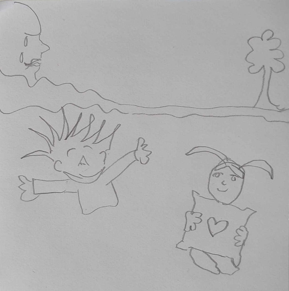
When the pencils came down, I noticed the others in the workshop mainly drew five round emoji faces. It’s quick, effective, and helpful in brainstorming ideas for digital solutions. Here’s the kicker: some people limit UX to the digital world, and a person in the workshop also mentioned that wireframing and sketching apps were challenging since that person was not used to it. But UX, to me (and many others), is first and foremost about problem-solving and human behaviour and emotions. The digital aspect comes in second.
What went through my mind?
Based on the prompt, I envisioned a teary-eyed woman crying a river leading down to a tree. Here, the river is also her long and weary hair. The energetic and spiky-haired boy symbolises happiness, and the spikes are supposed to look like sunbeams. Lastly, the girl hugging a pillow with a heart on it illustrates love.
Remember to ask yourself “Why not?”
I was told at the workshop that I am good at thinking outside the box, which is a nice complement but has become one of those overused buzz phrases. People keep saying that others should be better at thinking in new ways, etc. The downfall of my way of sketching outside the lines is that it is not as self-explanatory. Also, I know that the reason why I am capable of thinking outside of the box is due to taking similar creative courses, for instance, improv theatre. That is really the secret: Take more workshops. I think Jef Menguin has said it well: “Creativity isn’t a special club for the ‘gifted.’ It’s a muscle, and like any muscle, it grows stronger with use.” He notes that to be capable of thinking in new ways is to not be stuck on old ways and instead of asking “Why?” then instead of asking “Why not?”. If you as a reader happened to also have taken courses in improv, you know that saying “Yes, and” sparks new ideas and collaboration more easily than “Yes, but.”
2. Takeaway app wireframing
7 minute task prompt:
“Imagine you’re designing a food delivery app. Quickly sketch the main screen where a user picks a meal and the checkout screen. Keep it rough -boxes, icons, and buttons are enough!”.
Result:

Once again, I was too slow and only sketched the early user journey, while the others, perhaps completed the task. So, they also finished the checkout page. However, I was invested in my interactive idea of guiding a user in which pizza to choose from.
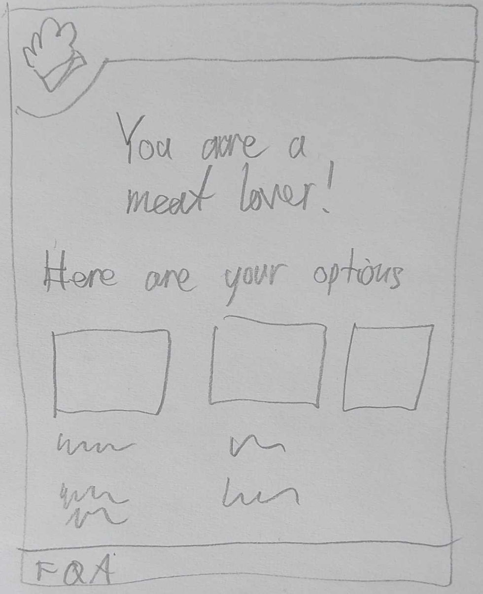
Spin the wheel
My idea was to add an image of a pizza on the main page with eight different slices to choose from. Once the user has tapped on one of them, it leads to another page showing options they might want to order based on preferences. The discount wheel pop-up and the show Wheel of Fortune inspired this idea.
Storyboarding
12 minute prompt:
“Sketch out a storyboard of a user who has a problem and then an app for takeaway delivery”.
Result:
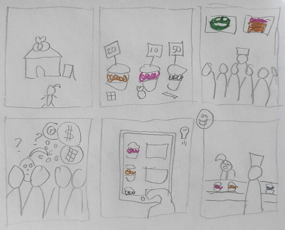
For this sketch, I thought of what is in the season regarding food, and it is, of course, the Fastelavnsboller. If you are Danish, then you especially know what I am talking about. But if you are reading this from somewhere else, hopefully, a warm place, it is this delicious pastry that is only available around February in Denmark every year.
If I can’t see the merchandise, then I am not interested
Now, I know that some chain bakery stores have an aesthetically pleasing and updated website where you can browse their items online before making a purchase in one of their many stores. However, I prefer taking my pastry business in the small family-owned bakeries that do not have a website with a menu page, and it can be difficult to get a proper overview of prices and varieties when I am there physically. As someone who rarely goes to bakeries and who does not know the names of most pastries and cakes, I feel uncomfortable making a decision right away by the counter. But I feel like I have to be quick both for the employee's sake and the other customers in line. So this sketch basically illustrates the importance of a menu page for the local bakeries since it is unlike supermarket aisles where you pick up groceries and then go to the cashier.
High-fidelity prototype of pizza app
Since the focus on user experience design is often on digital products, I thought I would give it a go with the pizza app idea. With the help of Illustrator to devide up a circle and then inserting images found on unslash.com and Figma to prototype the rest - menu, footer, etc., I made my pizza app to showcase a way to make user journey of order takeout more fun and interactive. Here, I included a made-up name for the pizzeria, Tony’s.

A way for Tony’s to differentiate themselves
With websites emerging from Web 0.2 to 0.3 and new digital inventions around the corner, many pizza places still have browser-like websites in the same style as Web 0.1. They spend their time perfecting their dough, so I don’t blame them. And sure, they market themselves as making authentic and quality-based pizzas, but so does the other pizza in town. This little quaky feature on the front page makes Tony’s stand out as the people with that cute website.
A special thanks to:
Hostress, place and organisation
YouTubers


I love the standard is as high as Tony’s grandmas! Is Tony italian in this situation? I get some italian wibes